
May 21
Redesign Accounts Screen
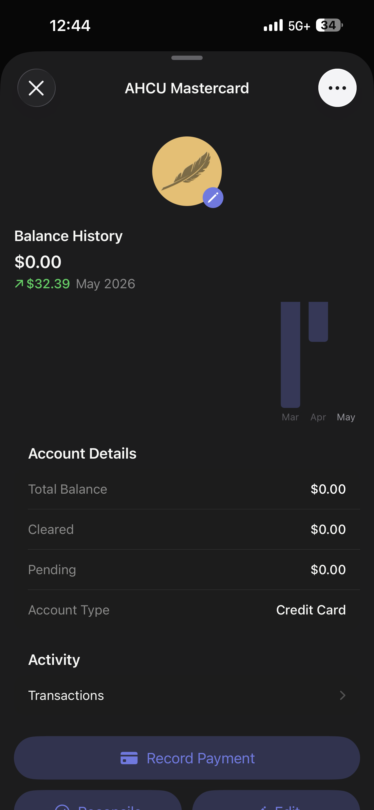
Hey, I know this one is a big ask but I feel like this screen can be redesigned a-bit better where I don’t have to click a separate button to see my transactions. Maybe when you click on an account, instead of a pop up, it would just lead to a different page with the account report, spending details and other buttons at the top in a more compact format and then all the transactions scrollable at the bottom. I think it would be a nicer less tedious screen like that. Thanks for the constant support!
Completed
Erik, can you update to 2.24.0 and let me know what you think? I kept the account in a sheet popup, but collapsed the info a bit and put the transactions on the same page where you can just keep scrolling to see them.